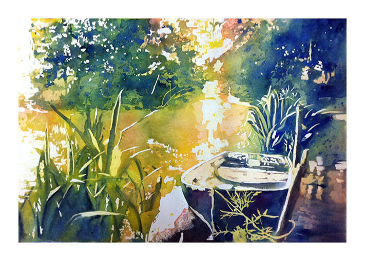
So I took the plunge and finally tried a poured watercolor painting. I will say that it is a totally different approach to watercolor and it requires a completely different way of thinking. It feels very methodical for me and requires lots of patience (which I sorely lack LOL!).
There are excellent tutorials all over youtube on how to do this. Basically, you just look at your reference image as a puzzle made out of layers from lighter to darker values. The result tends to have a posterized look to it especially if you do few layers. You can soften the edges between the layers somewhat if desired to soften the effect.
Several tools in Adobe Photoshop can help you visualize the value layers. A black and white version of your reference picture is critical in visualizing the main values present in your painting, which will become your layers. Do not skip this step since sometimes the eye can trick us in seeing value relationships correctly. Another useful tool is in Filter>Filter Gallery. If you select "Cutout" under "Artistic" and play with the functions you can better visualize some of the layers. This might join shapes into one layer which might look odd so do not go entirely by this picture.
Now use your favorite techniques to transfer your reference image to your watercolor paper. Add as much detail as you want. Draw your shapes as precisely as possible since this will help give you cleaner look at the end. Make the lines very faint in light areas but very dark in areas that will be dark. I used half a sheet (15x22 inches) of Arches 140 lb (cold pressed).
For the pouring method, you generally choose a triad of primary colors: a red, a yellow and a blue. I chose: Alizarin Crimson Permanent as my red, Indian Yellow as my yellow and Ultramarine Blue Deep as my blue (all from Mission Gold watercolors). Towards the end of the process I also used a cooler blue (Sennelier's Cinerous Blue which is somewhat opaque) and also Indigo to get my darkest darks. To make the liquid watercolors for pouring I put a little bit of each color (about the size of a dime) in a yogurt cup and added about 3-4 Tbsp of water. You have to play with this on your own. You do not want your liquids to be too pale nor too concentrated. I suggest starting with a small amount of water first, testing the liquids on a scrap piece of paper and slowly adding more water to adjust. I had to repeat this process a few times for this painting.
If there are any extreme whites in your reference picture, start by masking those areas out with masking fluid. You may wish to instead pour a very pale wash unto the lighter areas first before masking. For applying the masking fluid you can use a ruling pen, a brush (dipped in soap first), a Masquepen type masking fluid, etc. For areas with texture you can use a dry brush technique to just mask out the hills of the paper. Once the masking fluid is completely dry, you are ready to pour. In my painting, after I masked a few small areas of whites, I started by pouring very diluted yellow all over the wet watercolor paper (my 2nd lightest values). Depending on your reference image, it may make sense to pour the yellows first since it is the lightest color in your chosen triad.
Some people pour on completely dry paper and just force the paint to move around. I preferred to pour unto wet paper since the pigment moves better that way so I thoroughly wet my paper first with clear water before any pouring (remember that this will dilute your colors, so take that into account). You can pour directly from your cups or use a dropper for more control. You can also use a large brush to encourage the paint to move to a certain area. Remember that the effect of your pour will only matter in the areas that are not masked so take into account the predominant local color in deciding whether to pour red, blue and/or yellow paint in a certain area. However, do not worry too much about mistakes. If you put red in an area that was supposed to be blue either tilt your board so that most of the red runs off, leave it red and correct with more blue in subsequent layers (careful making mud though) or live with the blue if it is appropriate for your subject. Let the paint do its thing and don't meddle with it too much. Let this pouring dry completely on the page. Once the paper has lost its shine but is still wet (feels cold to the touch), you can use a COLD blower to speed up the drying process (a WARM or HOT blower will make the masking fluid stick to the paper). Even so, proceed with caution.
Once your first pouring is dry, you are ready to mask the areas that you wish to protect. Mask the areas with the 2nd lightest values (which you just poured) with masking fluid and allow to dry completely. Note how you're basically pouring a layer and once you do that layer and let it dry, you mask a portion of it to protect it from the next pouring (so that area doesn't go any darker). I then poured mostly yellow (and a tiny bit of my red) unto most of the paper for my 3rd lightest value. In some areas I started building up the yellow green values as well. Let this pouring dry and once completely dry, go ahead and mask your 3rd lightest values (that you just poured). In my case, the next area to be poured was some orange areas around the periphery of the trees and in the water as well as some yellow greens in areas. Use your knowledge of color mixing to adjust pours in subsequent layers and get the colors you need. For example, layer 2 primaries for secondary colors or let them mix on the paper in a single pour. Or layer 3 primaries for browns and grays or again let the 3 pigments mingle on the paper--which is risky and may result in mud, so I'd rather layer.
In general, in my painting the approach I followed in the masking/pouring process was:
- Whites first
- Followed by light yellows
- Followed by warm yellows and yellow greens
- Followed by oranges and greens
- Followed by darker greens and blues
- Followed by indigo and cinerous blue (also spattered in areas for additional texture)
Which is basically moving through both sides of the color wheel starting at yellow all the while working my neutrals (grays/browns) out and correcting them layer by layer. It took me about 6-7 layers to get something pleasing. I then removed all of the masking fluid and here is the result: